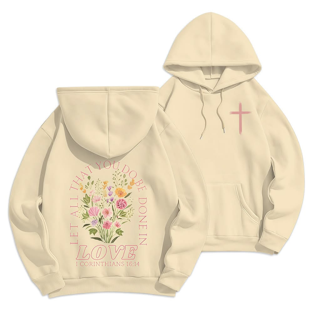
Butter floral hoodie
Favorite overall
The most resolved balance of garment color, open space, flowers and type. Large enough to matter; delicate enough to wear easily.
Carry forward: the airy composition.
Eight references, studied for their artwork, placement and technique. The useful details to carry into our own development.
The strongest graphics connect one clear idea with deliberate color, scale and surface detail.
Prepared for Alex · October 30, 2026
Gerald’s design assessment
Select an image to see its technique and design notes.
All images are Alex’s supplied references. Palettes are visual approximations. Photos do not confirm factory methods, physical dimensions, hand feel or selling performance.
Separate the visible effect from the process we would test.
Swipe the table to compare all columns.
| Reference | Route to sample | What needs checking |
|---|---|---|
| Butter floral hoodie | Soft-hand multicolor print; retain tonal separations | Fine stems, open outlines, hood clearance |
| Floral-cross hoodie | Spot-color print with shared colors across blooms | Cross silhouette, small vertical lettering |
| Coral turtle tee | Compare detailed screen-print and digital samples | Tonal water, turtle edges, actual washed ground |
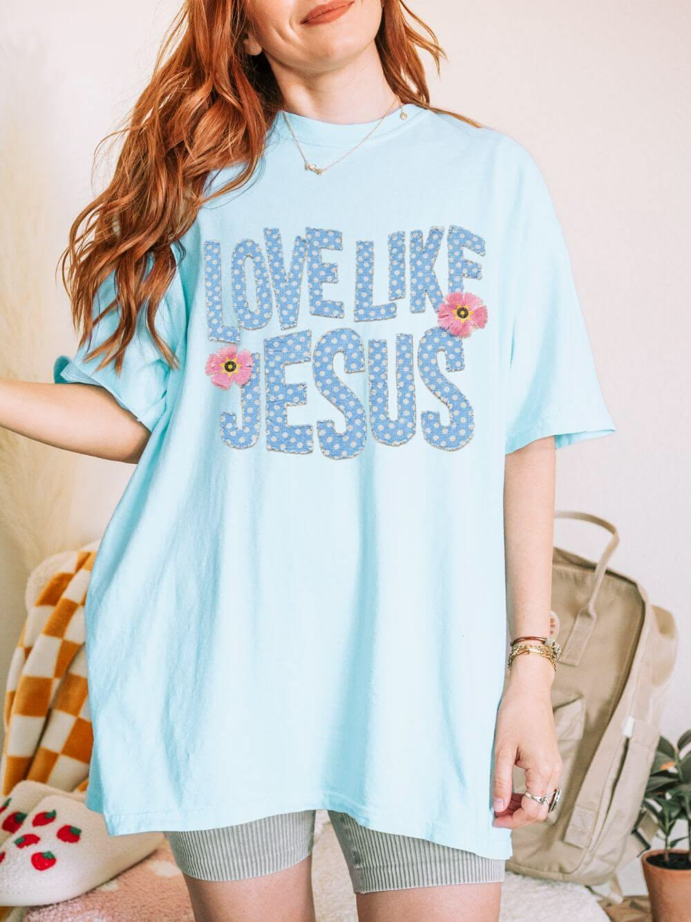
| LOVE LIKE JESUS | Compare real fabric appliqué with printed simulation | Edge stitch, counters, backing and wash behavior |
| Coastal tiles | Multicolor flat print with garment-colored gutters | Large-area hand feel, fine pale lettering |
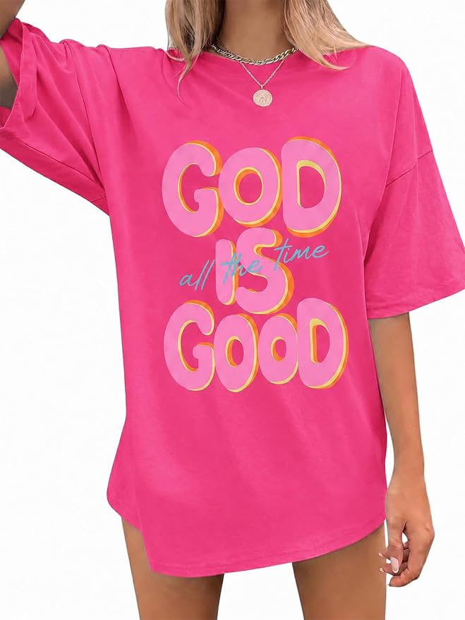
| GOD IS GOOD | Flat spot-color print first; optional puff trial on main letters | Offset registration, script legibility |
| GIVE GRACE | Multicolor print with separate outlines and stripes | Fine borders, alignment, message hierarchy |
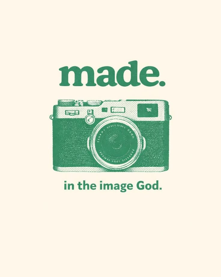
| Camera | One-color halftone screen-print trial | Dot retention, worn detail, corrected copy |
Screen print, digital print and transfer are application routes. Watercolor, distress and shadow describe appearances. Appliqué and embroidery describe construction.
Set dimensions from the garment pattern. Ask the printer to prove fine detail, color, registration and hand feel. For stitched work, check backing, puckering and wash behavior.
Process background: CottonWorks: printing types and techniques. Source supports process distinctions; route recommendations above are Gerald’s proposals.
Chosen for different strengths. This is my design judgment, not a sales ranking.
Favorite overall
The most resolved balance of garment color, open space, flowers and type. Large enough to matter; delicate enough to wear easily.
Carry forward: the airy composition.
Strongest idea
The object gives the phrase meaning. One green and purposeful texture are enough. The missing “of” in the supplied copy needs correction.
Carry forward: a visual idea before decoration.
Best material direction
The tiny floral fill, irregular edges and two pink accents give big lettering a softer character. A useful starting point for real appliqué development.
Carry forward: patterned material inside bold letters.
These are the decisions I’d use to judge our own work.
Recognize the word, symbol or silhouette before studying the details.
Let the garment act as a real color. Assign separate roles to main, supporting and accent colors.
Leave room around the message. Keep hoods, seams and rib clear unless crossing them is intentional.
Pattern, texture and small motifs should strengthen the idea and survive the chosen process.
Match the character of the type, illustration and surface treatment.
Proof the words, print or stitch the details, and judge the sample on the real garment.
Borrow the design principle. Redraw the art, recompose the placement and develop our own material story.
 Starting reference
Keep the lightness; develop a different floral composition.
Do not trace the bouquet or retain its exact text frame.
Starting referenceUse the camera’s conceptual clarity to create a different idea.
Working concept only. Phrase and original artwork remain to be developed.
Starting referenceMake patterned fabric the main design feature.
New construction proposal, not a claim about the reference.
Would it still have its own identity beside the reference? A new slogan or color alone is a weak change. The idea, drawing, composition and material decisions should form a distinct design.